
Frogplum Solutions UX/UI Design Internship
Frogplum Solutions is a company composed of a group of creative individuals with a passion for technology. Their one and only objective are to help businesses, including start-ups to create a significant impact in their industries. My role while working at Frogplum was a User Experience & Interface design intern, where I worked on several projects that involved creating wireframes, prototypes, as well as branding and marketing materials.
User Experience & Interface Design
Sapphire Hospital Management System: Web Design
At a Glance: my role and contributions!
Role: Lead UX & UI Designer, Prototype Designer, Interaction Designer
Tools: Adobe XD, Illustrator, Flow Map
Team Members: 2 UX/UI Designers, 2 Developers, 2 Marketers
Date: Sept. - Dec. 2019
Contributions: Identifying problems with the existing website and areas for improvement
Conduct precedent studies of websites similar to Sapphire HMS
Creating low-high fidelity wireframes and mockups with interactions
What is Sapphire?
Sapphire is an all-inclusive hospital management system that can be integrated and customized for any health care institution. With Sapphire, they offer 5 main services that include: Sapphire Emergency, Sapphire Pharma, Sapphire Clinician, Sapphire Hospital, and Sapphire Care. My role in this project involved creating a redesign for Sapphire’s website both mobile and desktop, creating wireframes, layouts, graphics, and final mockups.
Problems With The Existing Website
Sapphire’s 5 main services were being poorly promoted. Upon arriving on the landing page, new customers are only shown icons of the services and products being offered. This leads them to be a bit confusing as to what they were for, if they were even clickable and interactable, or if they were there just for the display.
The information felt repetitive and clumped up together. Landing on any of the product pages, information was overly detailed and lacked a sense of hierarchy, even though all of the pages had similar structures and layouts.
Stock images did not adequately express the aims of services. As stock images were being used for every product/services page, they didn’t really have much of a purpose aside from showing what device Sapphire’s HMS could be used on.
What Sapphire’s Website Looks Like
Sapphire’s Old Website: Main Landing Pages
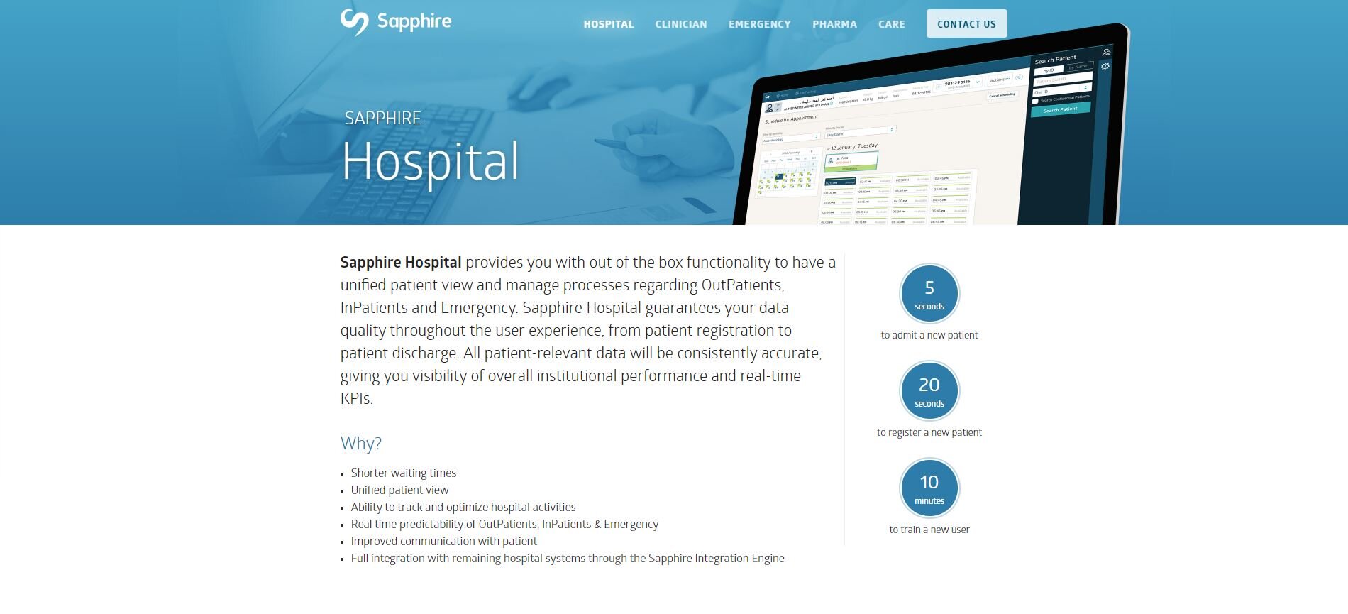
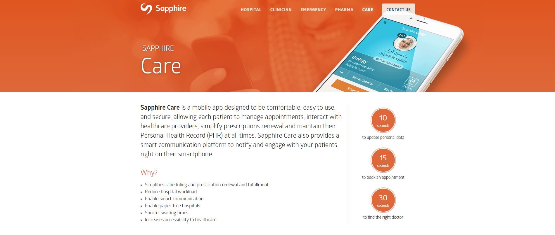
Although the entire website was going through a redesign, the pages that looked significantly different and gave each page a fresh new look are the main landing pages for each of the services that Sapphire HMS offers. As we can see above, the pages are a bit dated and needed a fresh new look mainly for the purposes of attracting new customers.
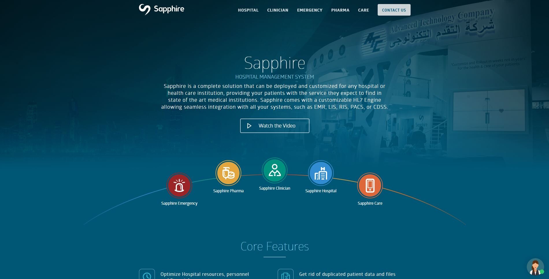
Sapphire’s New Website: Main Landing Pages
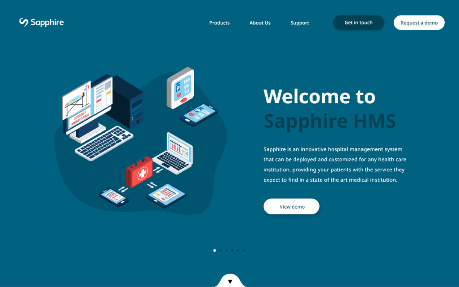
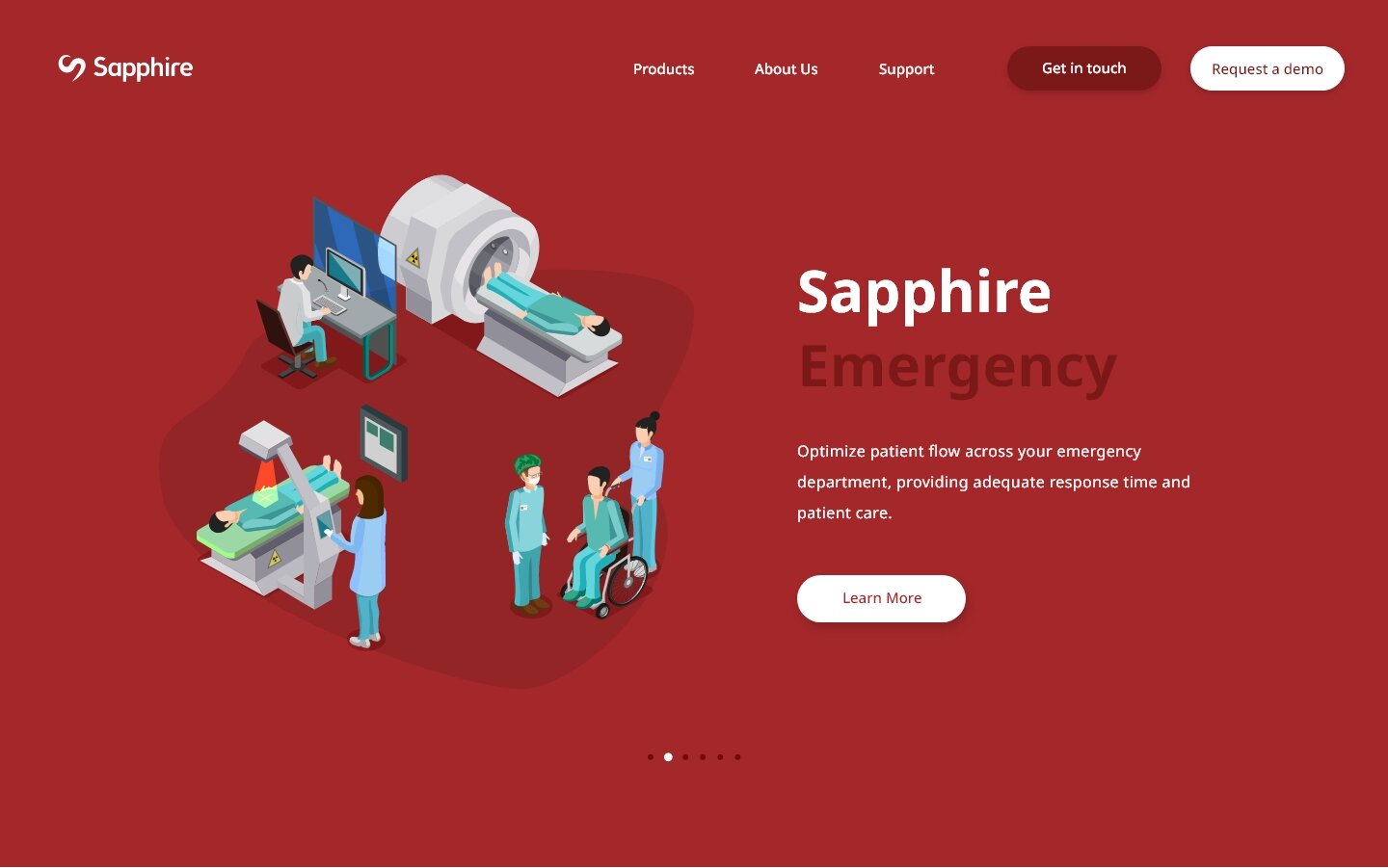
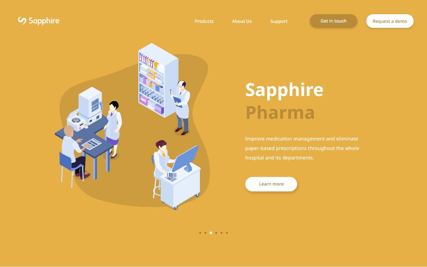
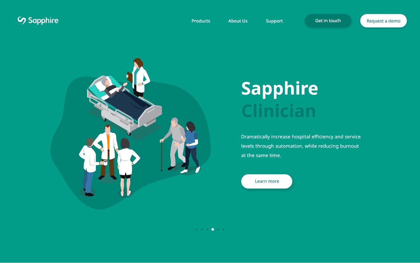
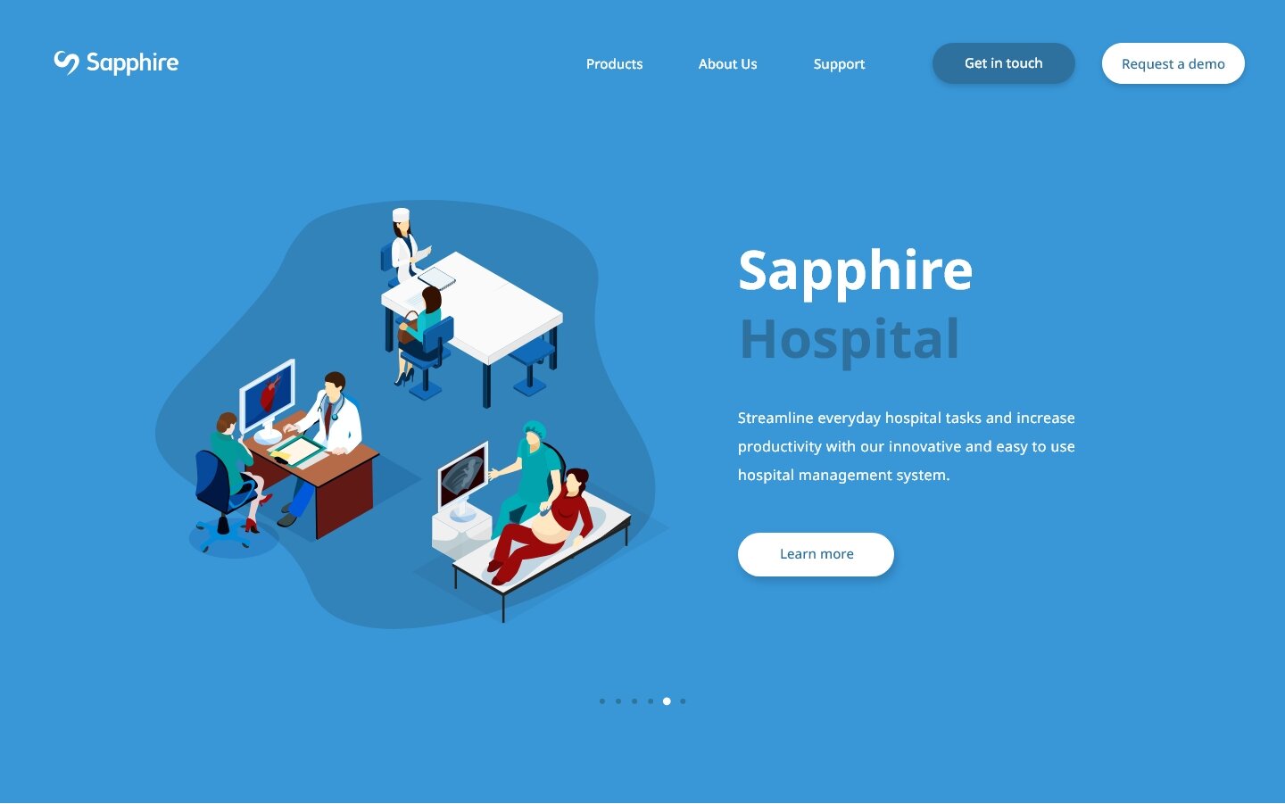
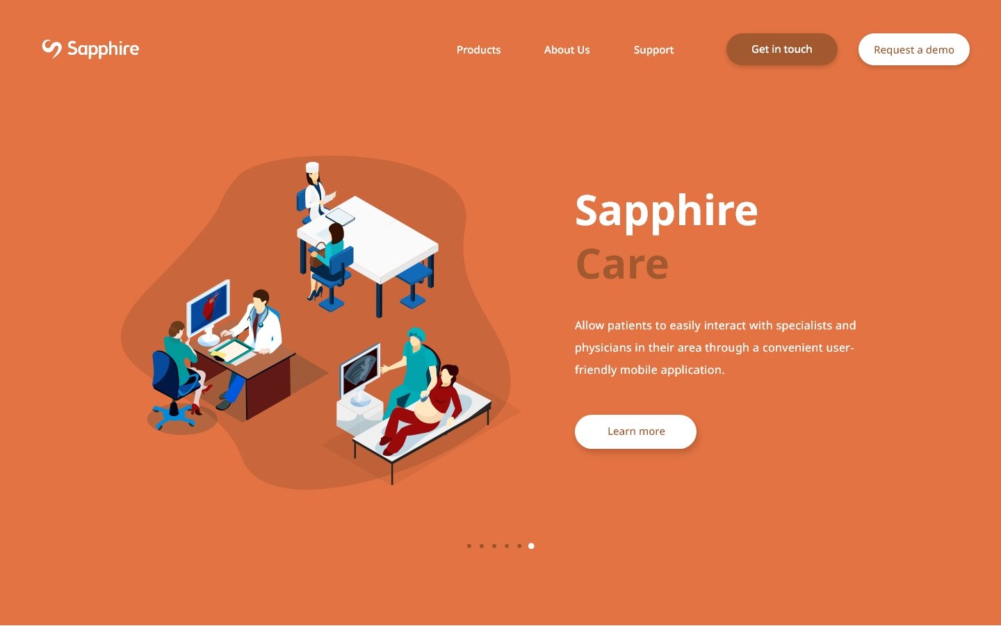
While redesigning Sapphire’s main landing pages, I put my focus towards how their customers would be receiving information about the services and products being offered. For example, instead of having icons that gave no real context towards Sapphire’s services, I instead separated them into their own hero space. With the use of graphics and a simple layout, I was able to give each of the products/services a quick and brief introduction.
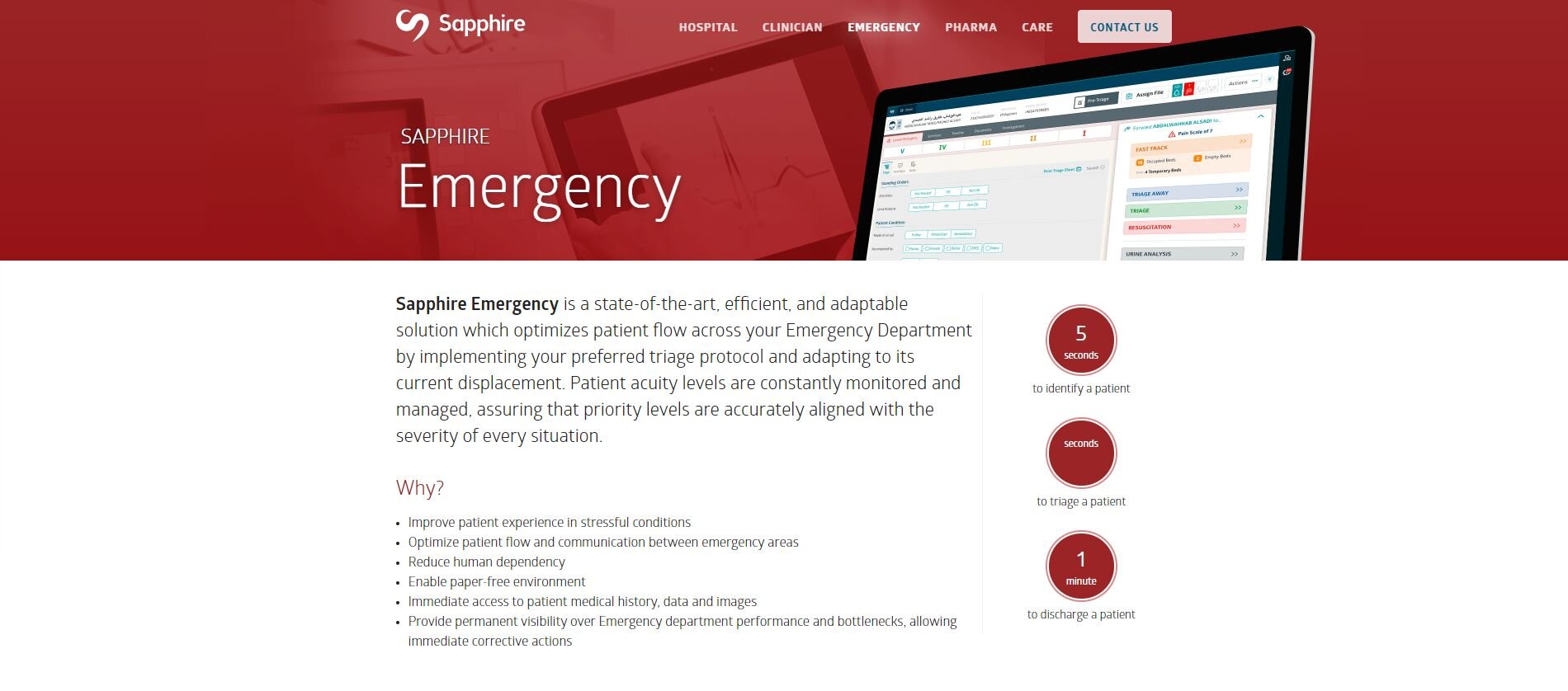
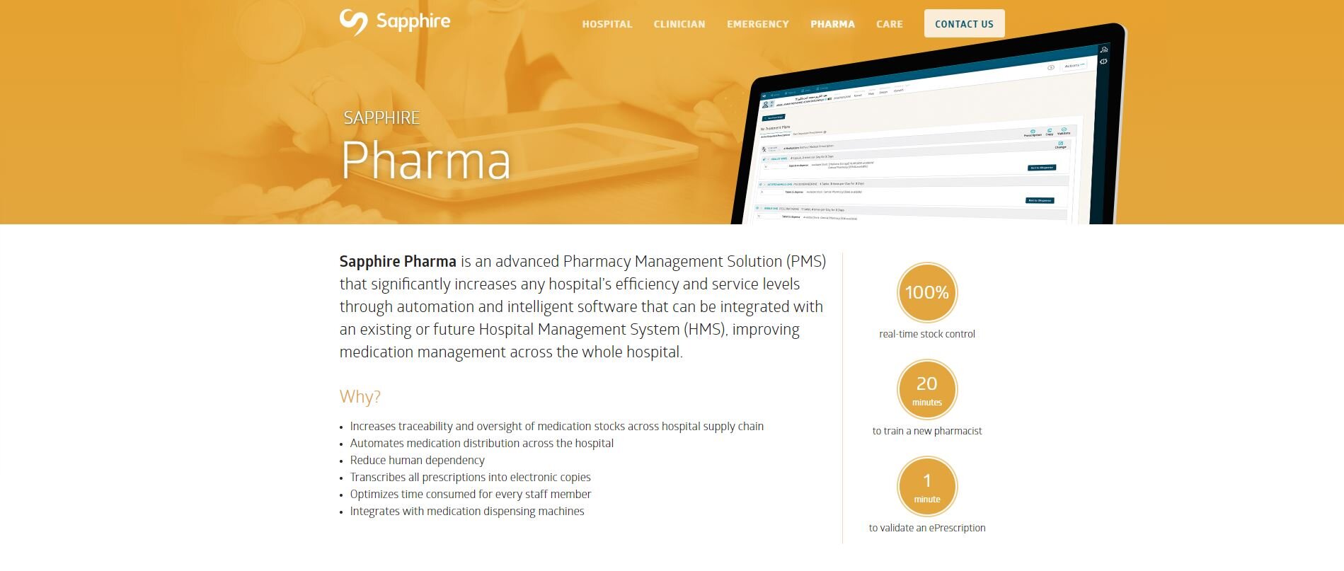
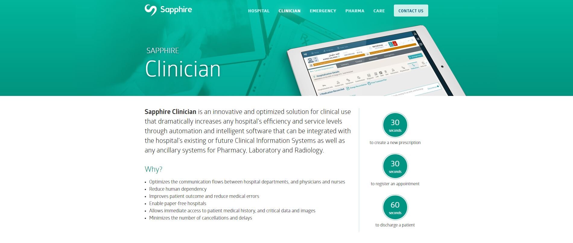
Sapphire’s Old Website: Product Page Structure
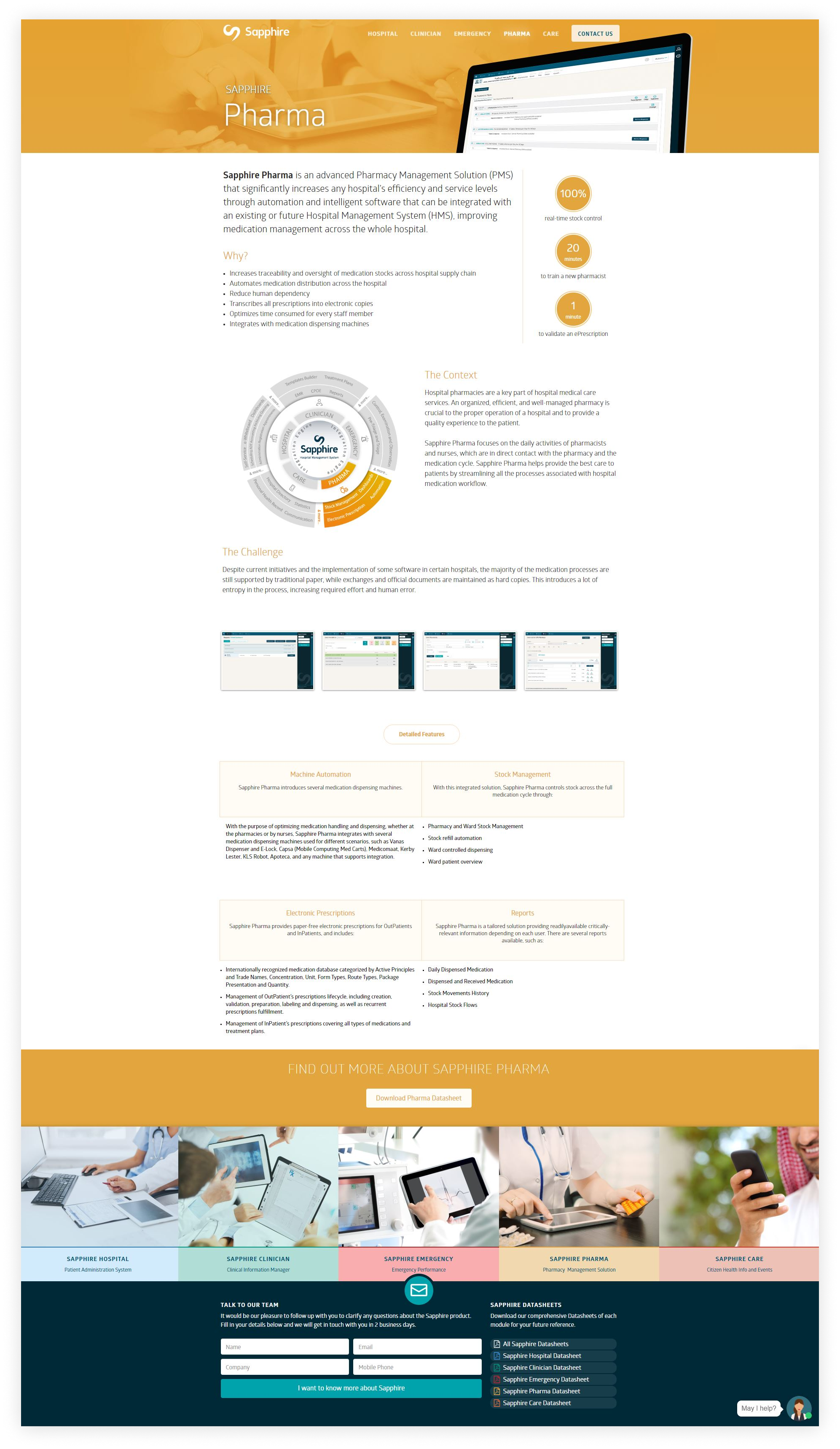
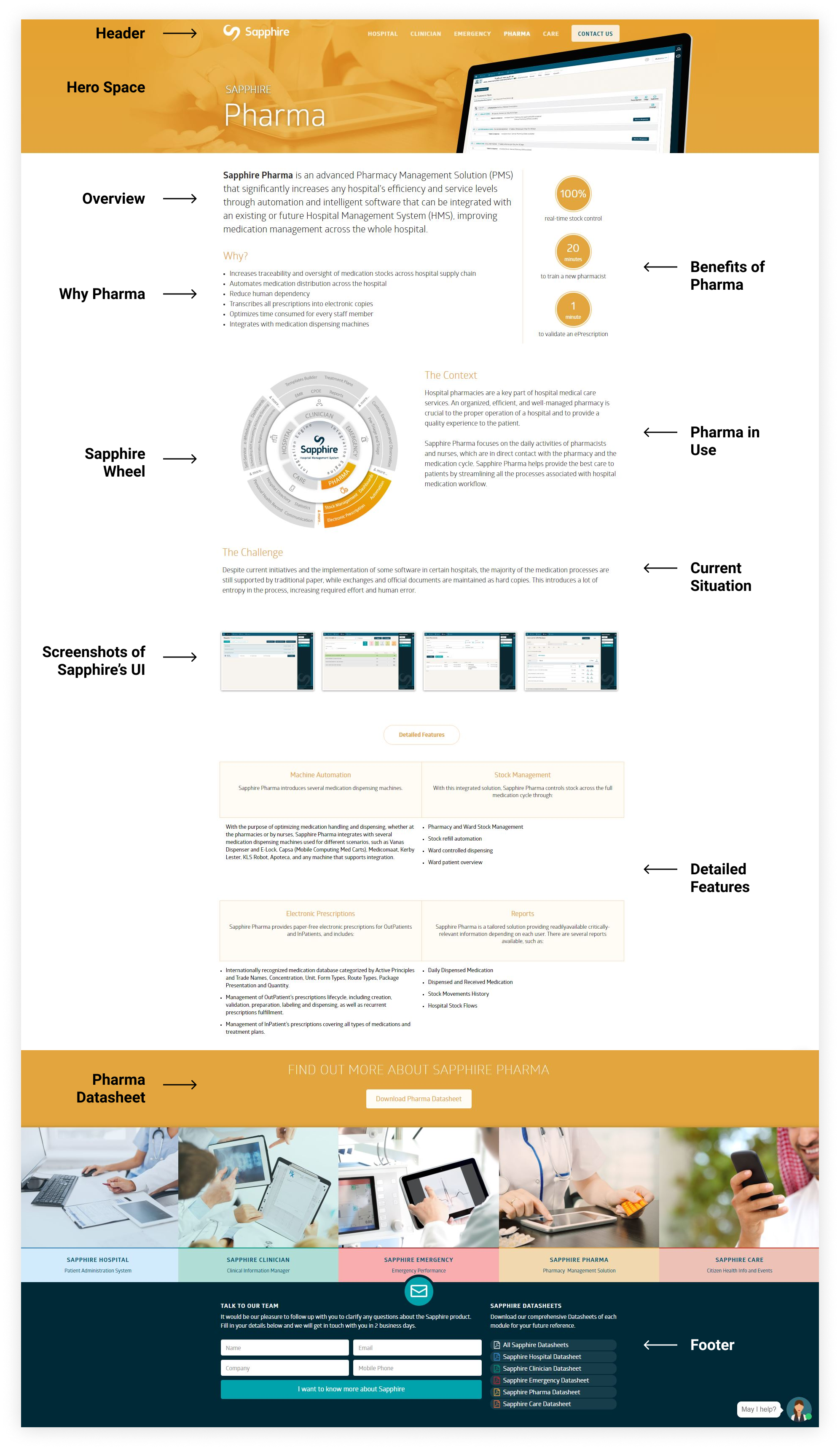
As previously stated with the problems of the existing website, information felt repetitive and clumped up together. This is due to how the focus is centered around the copywriting for the features and functionality. An example of this is with the image shown above, where there are detailed explanations of the product features, with supporting product images. More specifically, the elements and text here are imbalanced: there is a large amount of copywriting, and the screenshots of Sapphire’s interface don't show very much of the product or are very small.
Sapphire’s New Website: Product Page Structure
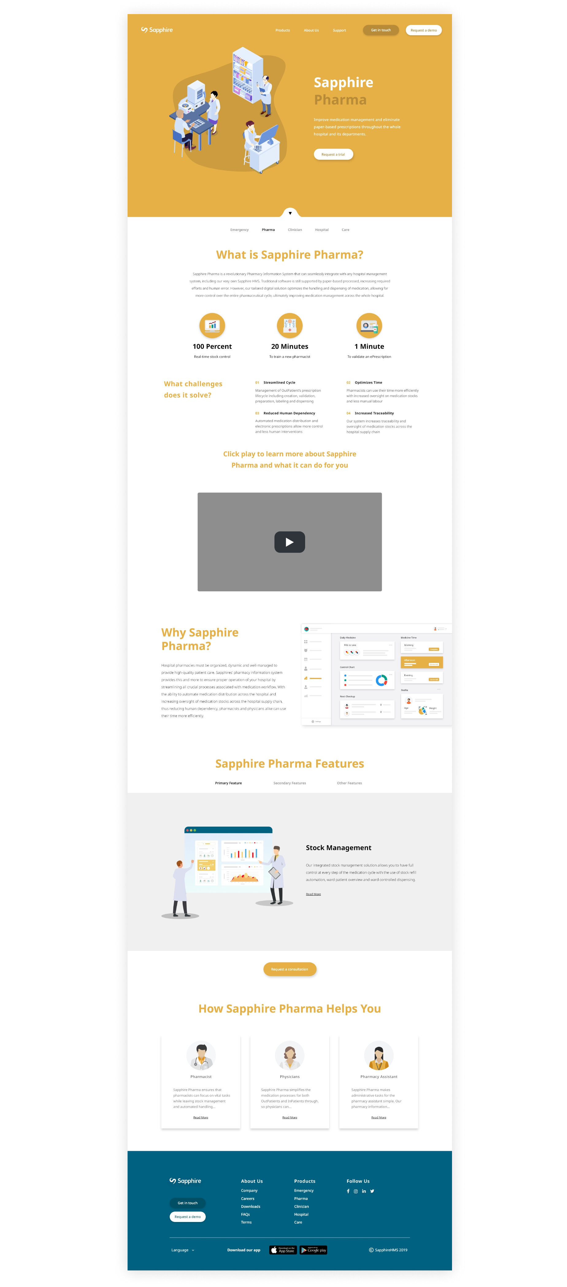
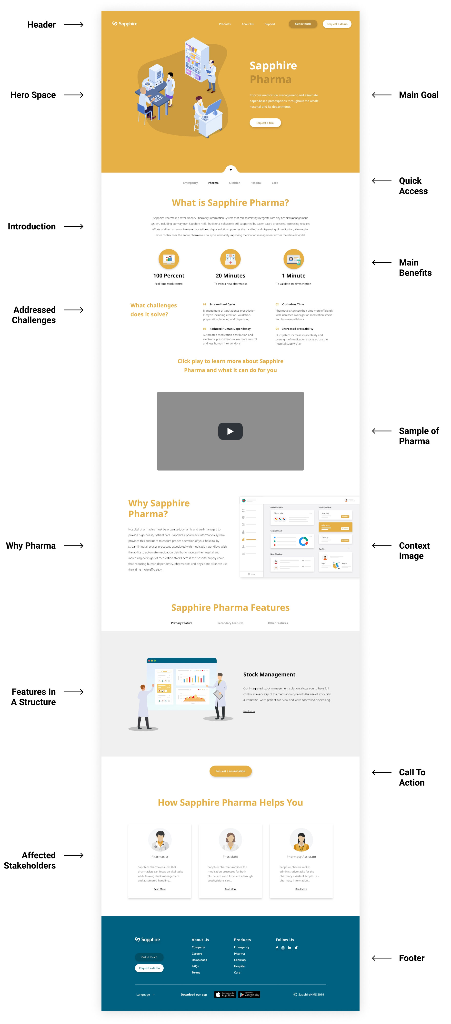
Instead of replicating the problems with the old layout, the solution I offered and created was really geared towards being more user-friendly while still focusing on the features and functionality of each Sapphire’s products. To be more specific, there is now a greater balance of text and graphics along with a new sense of hierarchy when presenting all of the features of the given product. As well, the use of graphics felt more necessary compared to the use of stock photos and screenshots of Sapphire’s UI, as it better communicates what the product has to offer. Near the bottom of the page, we have now also added a call to action button allowing customers to request a demo or consultation of the product.
Wireframes & Design Decisions
Sapphire Homepage Wireframes
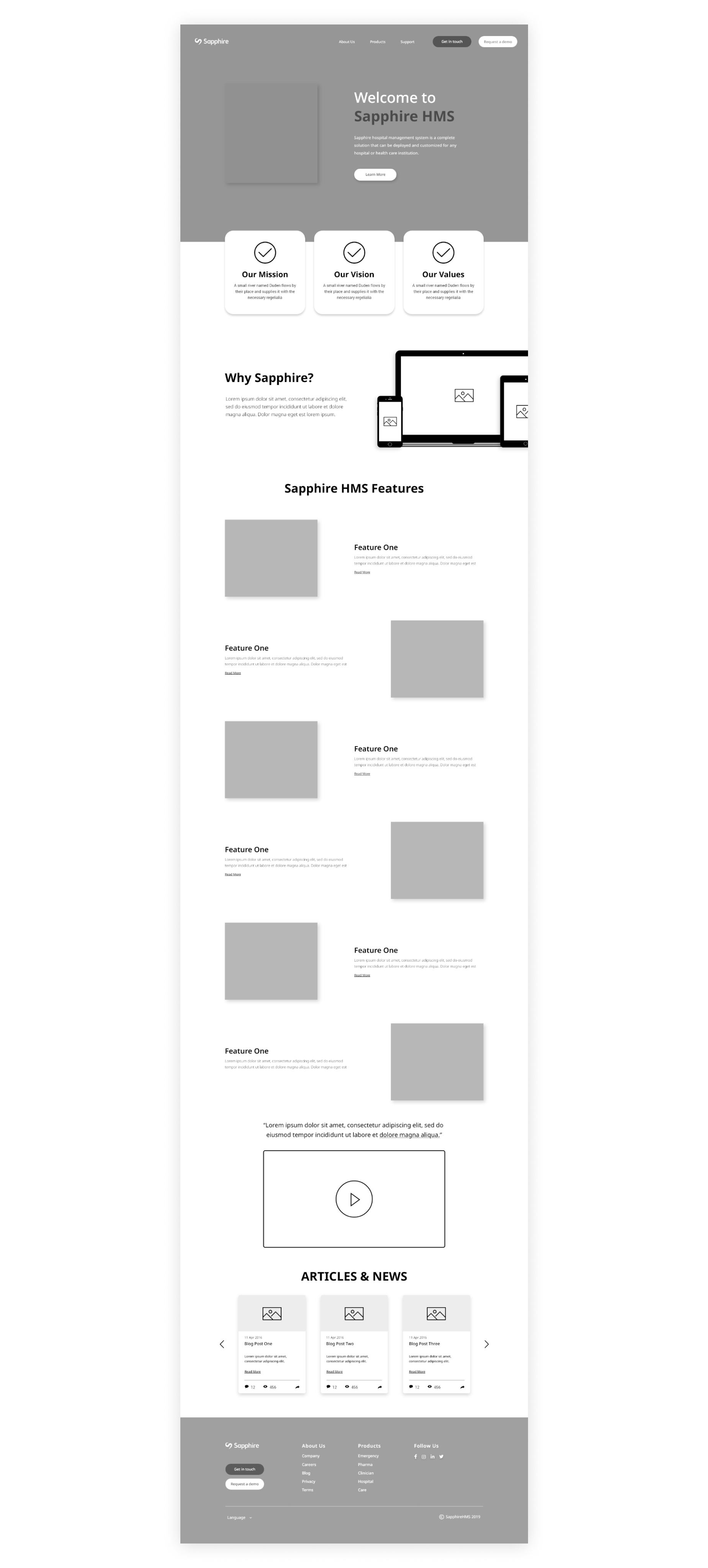
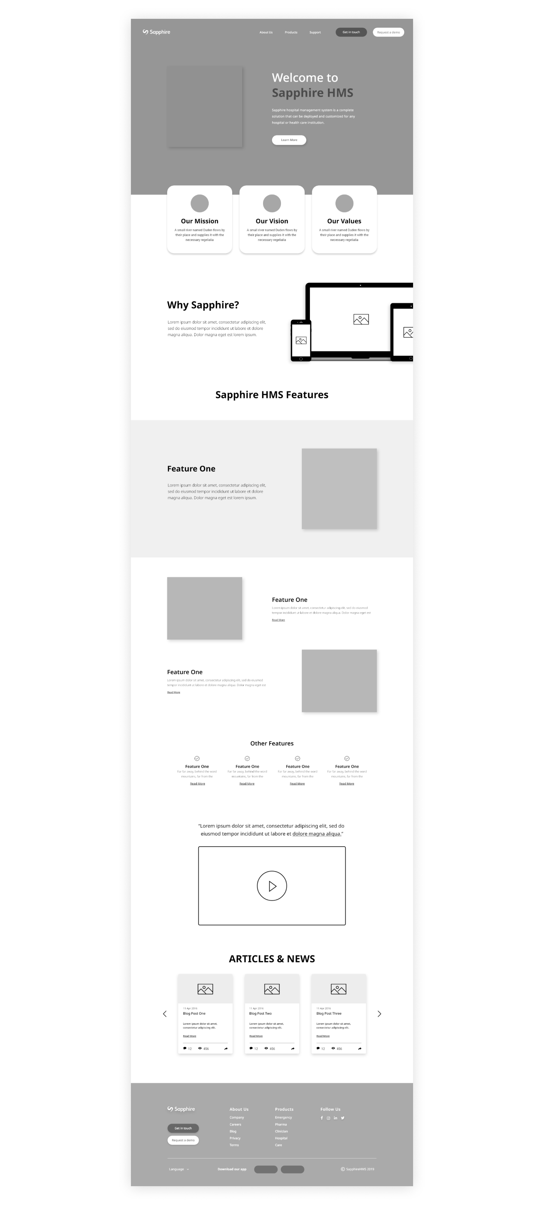
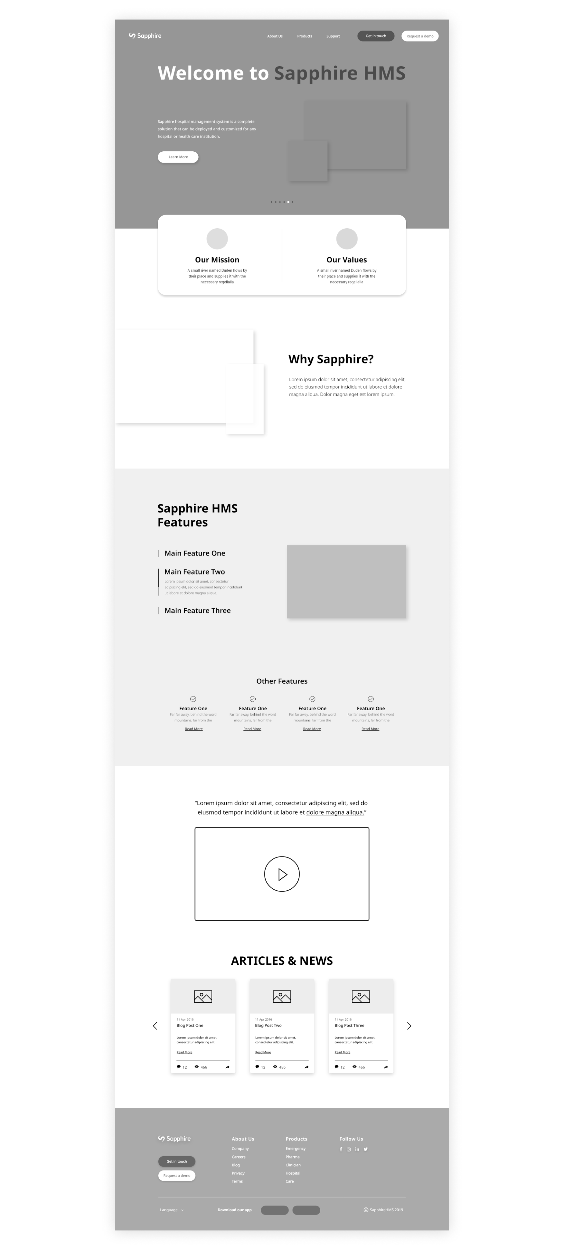
Before creating the final designs of Sapphire’s website, my manager had me create a few wireframes to see how we could lay out the content given to us. Having said this, with the first iteration the home page felt very long as each feature was separated on its own. With the second iteration it still felt a bit long and with the addition of the devices was just repeating the same problem Sapphire initially had with their old website. Lastly, for the third iteration, we were still able to highlight the main features of Sapphire as a whole. To be more specific, instead of using mockups with their UI, I instead had the idea of creating a graphical interface that would still communicate what their hospital management system offers.
Sapphire Finalized Style Guide
Previously, the old website was using the Glober font family, however, after discussing with our client, they wanted a new look and a more modern-looking font. Apart from this, they still wanted to keep the same colours for each of their services, although, it was my idea to add accent colours for each of the products to help improve the quality of the graphics and attract new customers.
Interactive Prototypes
Sapphire Hero Space Promotion
I’ve created an animation for each of the products to be promoted on the homepage. This helped developers understand graphic transitions, and I thought was a creative way to really appeal to new customers.
Site Accessibility & Navigation
Content is now more balanced between the text and graphics. This allows for content to be communicated more clearly, while also being readily available for quick and easy access.
Challenges
There were many challenges I was faced with during my time at Frogplum, for example learning how to use new design tools such as Adobe XD and Flow map. In addition to this, I also was often asked to use Photoshop to help create marketing materials, and this is something that I’ve also become more confident in using on a daily basis. More specifically though, working on the Sapphire HMS website, one of the biggest challenges I was faced would have to be figuring out what the client wants while still achieving the goal of attracting new customers, and also working with the developers to see if my designs were actually plausible. How I overcame this was by getting personal and talking with the CEO of marketing for Sapphire, as well as, follow up with developers frequently enough to make sure my designs could be developed. In summary, with every challenge I overcome, I always see improvement for growth, and this is something I want to continue applying for any future companies I get a chance to work with.
Final Thoughts
Overall, my time at Frogplum was extremely valuable as I was able to work in a team filled with passionate individuals, as well as, gain several new experiences. These experiences involve working closely with a client, understanding how developers work and how to communicate with them, and even working with the marketing team making sure our goals were in alignment. Even though I faced a few challenges at first such as learning how to use new design tools, I eventually became more proficient in using them. In short, I was very happy with my internship at Frogplum, and I believe working there has helped me become a more flexible and knowledgeable designer, as I am now able to use more tools and come up with more creative ways when designing for a client.
© John Latay 2021